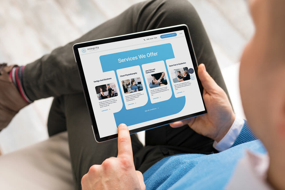
You might notice that things are looking a little different here – and we’re so excited to show you around.
It’s been over six years since we opened our doors to the wonderful community of Como and beyond, and we’ve seen some incredible growth.
Our top priority has always been ensuring excellent patient care, and giving them the knowledge and understanding of their pain or condition so they can address the root cause – not just the symptoms.
A big part of that is our website. As often a first point of contact, we knew we needed a bit of a refresh to make sure it looked good, was easy to navigate, and gave our patients the information they need.
We’ve been working with the team at Dilate Digital for several years now, so when it came to a website refresh, it was a no-brainer.
We’re stoked with how it turned out. Welcome – have a look around!
What’s new?
A brand new look
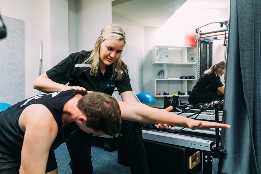
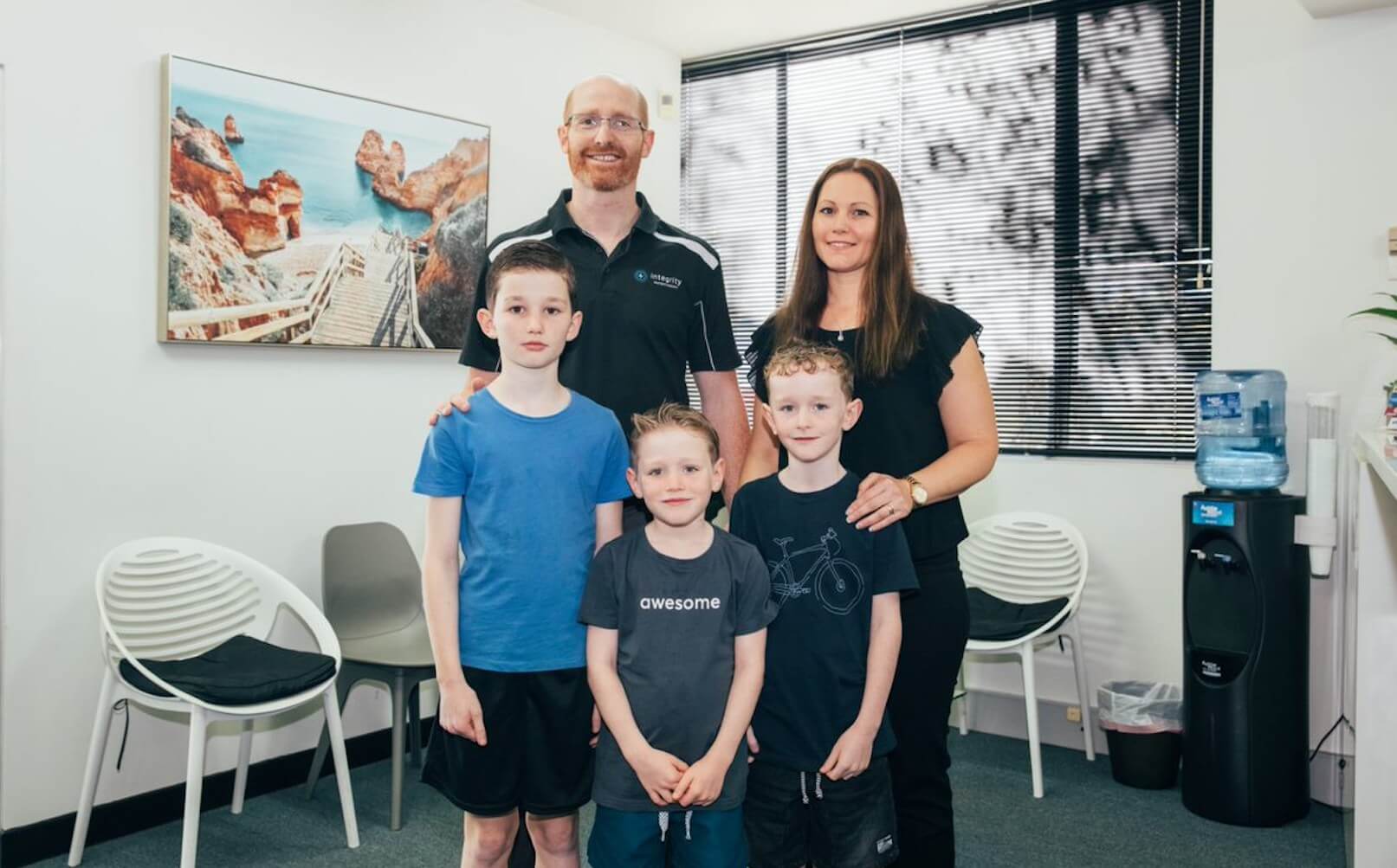
We wanted our new website to be highly visual. We did away with a lot of the old stock imagery we used to have and replaced it with professional photographs of our amazing team in action, so you can see exactly what to expect when you come in for an appointment.
The visual elements are also a lot more streamlined, with crisp shapes that both look good and reflect our professionalism and integrity.
Better functionality
We wanted our new website to feel as good as it looks as you’re scrolling through.
That meant introducing a smoother scroll functionality, as well as animated content blocks that rise up as you scroll.
Better navigation
Our dropdown navigation is a lot more responsive and streamlined, giving a much better user experience and allowing you to find the information you need as easily as possible.
We did away with anything unnecessary to ensure everything was as streamlined and straightforward.
Have a look around!
We hope you love the new website as much as we do. Have a click around, and book an appointment if you need a little TLC!


